Tips for Mobile Commerce Apps Design
Simple and practical tips for designing mobile commerce apps for stores and restaurants to get more people buying.
Thinking about a simple app for your shop or restaurant? Good move—U.S. shoppers made a majority of 2024 holiday purchases on smartphones, and that mobile habit is sticking. Below are design-first, beginner-friendly tips. If you want a human partner while you build, you can always peek at our Launch Smart Digital work, skim a quick About, or check our mobile commerce app overview.
1) Pick one clear goal for version one
Design your first release around a single job: fast ordering, quick browsing, or smooth checkout. Keep visuals tight to that goal—one headline, one main action, and supporting art or icons only if they help the click. This focus makes your mobile app design easier to test and refine.
2) Keep navigation obvious
Use a bottom bar with 3–5 plain labels (Home, Shop, Cart, Account, Help). Keep icons consistent and names simple. Bottom navigation is the standard pattern for quick jumps between top-level sections, so it feels familiar on day one.
3) Make buttons easy to tap
Size targets so thumbs never struggle. Aim for at least 44×44 pt on iPhone and 48×48 dp on Android (you can keep the visual button smaller while the tappable area is larger with padding). Add a clear pressed state.
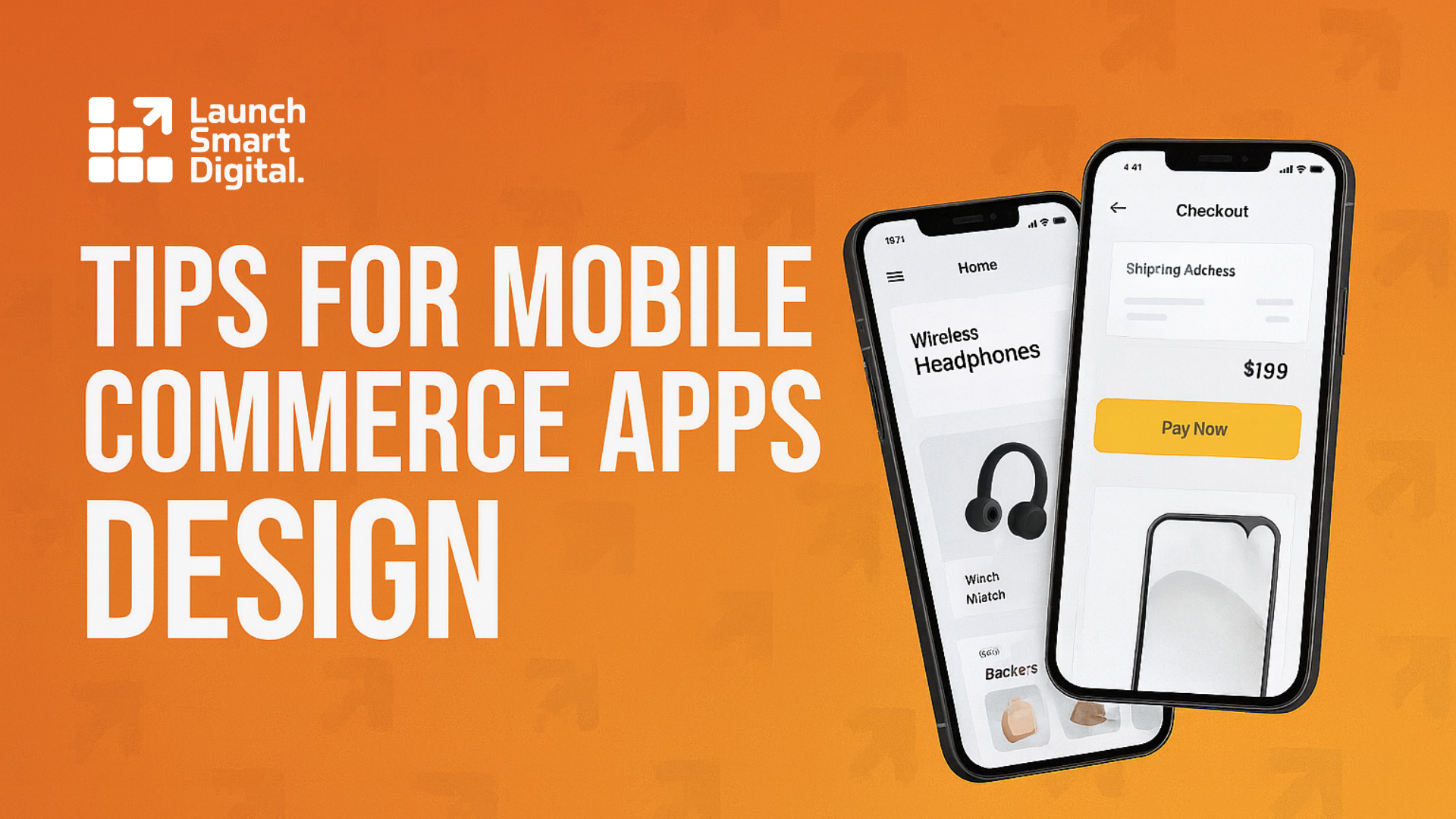
4) Write scannable product pages
Design for quick glances: bold product name, clear price, short benefit line, and 3–5 specs in bullets. Use a readable type scale (don’t go too light on weights) and generous spacing so details don’t blur together. Apple’s typography guidance favors legible sizes and weights over thin, decorative styles; Material’s type scale helps keep hierarchy consistent.
5) Remove checkout friction
Most carts never convert, often because checkout feels long or confusing. Keep forms short, show total costs early, and remove distractions from these screens. Clear labels, a single accent color for primary actions, and a visible progress indicator all help. (Average cart abandonment hovers near 70%.)
6) Offer fast payment options
Place Apple Pay/Google Pay high in the flow (cart and product pages if possible). Stripe’s testing shows much higher conversion when Apple Pay appears earlier as an express option. Use platform wallet marks at consistent sizes and spacing so they’re instantly recognizable.
7) Accessibility is good business
Color choices are design decisions and legal risk. Keep text/background contrast at least 4.5:1 for normal text and 3:1 for large text. Make links and controls obvious, with states for focus/press. These basics improve readability for everyone.
8) Make it fast (design choices matter)
Use few, sharp images instead of heavy galleries. Export right-sized assets, prefer modern formats where possible, and lazy-load off-screen images—never the hero. Snappy visuals feel premium and lift completion rates.
9) Test on real phones (design QA)
Open the app on different screens. Check contrast in sunlight, spacing with one hand, and whether labels truncate. Verify icons read at small sizes (stick to a single icon style; SF Symbols/Material icons provide consistent weights and grids).
10) Measure a few simple numbers
Track add-to-cart, checkout completion, and time-to-buy. When a metric dips, your design gives you the levers: contrast, copy clarity, button prominence, spacing, and image weight. If you want a quick second opinion, drop a note on our contact page and we’ll point you to the smallest win first.
How Launch Smart Digital fits in
We keep your visuals clean and consistent—color system, type scale, icon set, and spacing grid—so the interface looks “put together” across every screen. If you want to see how we scope and style commerce apps for stores and restaurants, browse our mobile commerce app overview or start from our homepage and learn who we are.
Ready to map your app in one short conversation? Choose a time that works for you and we’ll sketch a lean visual plan you can act on right away: pick a planning slot.