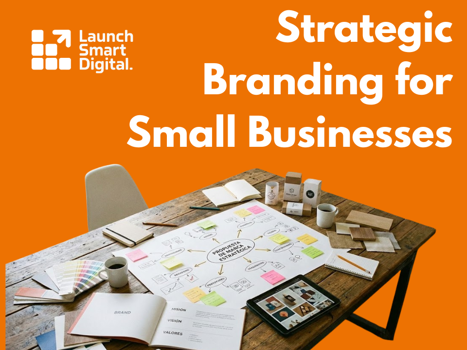
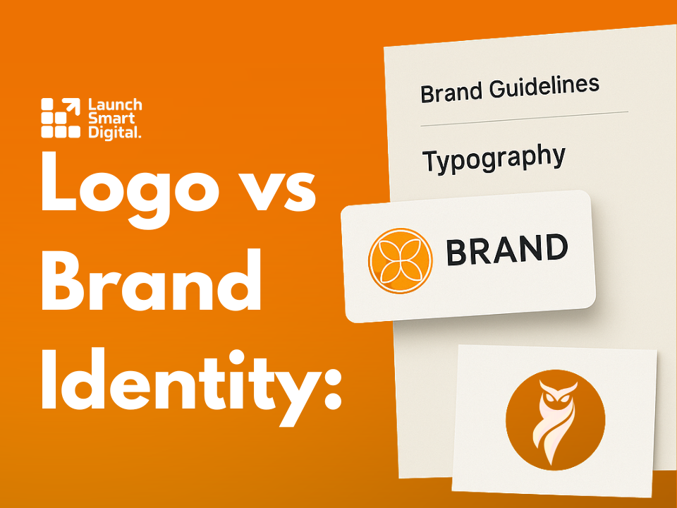
Logo vs Brand Identity: What Small Businesses Need to Know
Your brand is more than a logo!
Why branding matters beyond a logo
A logo is a sign on the door. Brand identity is the full experience that makes people remember you and return. It covers how you look, how you sound, and how you make customers feel. When these parts work together, every post, email, and conversation builds recognition and trust.
What a brand identity really includes
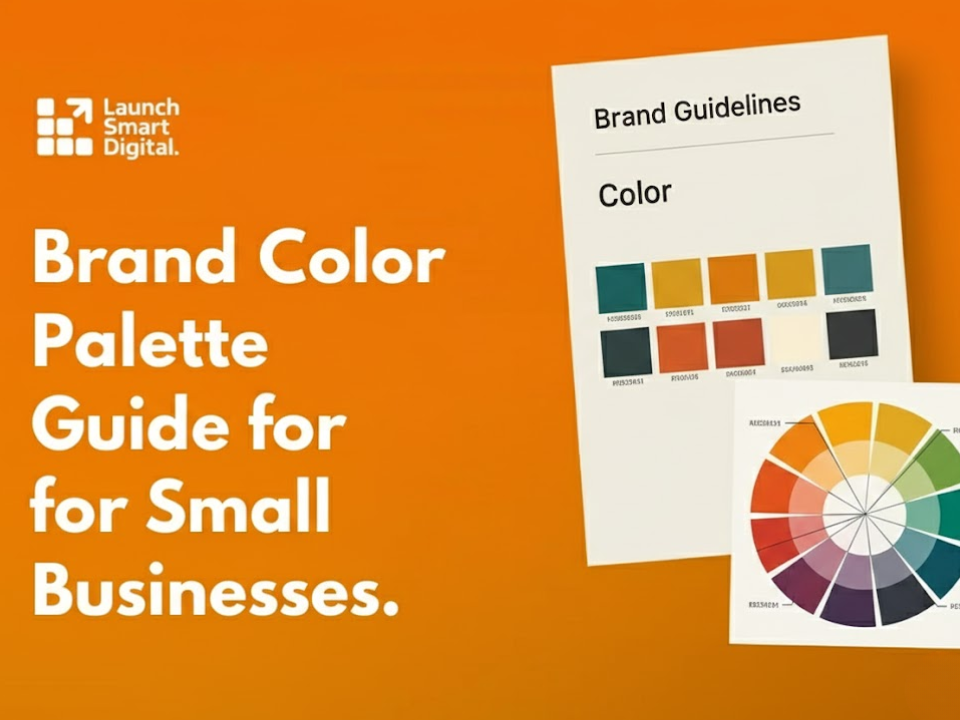
Think of your identity as a system that removes guesswork. It defines your story, audience, and promise. It sets a color palette, typography choices, imagery style, and a clear voice for copy. It also documents usage rules so any designer or team member can create consistent work without starting over each time.
How strong branding drives sales and loyalty
Customers choose the option that feels familiar and safe. Consistent branding shortens that decision time. It makes your offer easier to spot and easier to believe. When your look and voice stay steady across web, social, packaging, and store, people feel they know you. That comfort leads to higher conversion and better margins.
Brand identity and the customer journey
Discovery begins with a glance. A clear visual system helps you stand out in crowded feeds and search results. Next comes evaluation, where tone and messaging shape trust. After purchase, the same identity guides onboarding, support, and follow up. This continuity turns one time buyers into advocates who tell friends and return on their own.
When to invest and how to start
If your marketing feels scattered or slow to produce, you are ready for an identity system. Start with research and a short strategy that says who you are for and what problem you solve best. From there, create a logo suite, color and type rules, imagery direction, and practical templates. Then document everything in simple brand guidelines that your team can use tomorrow.
Branding for digital and physical touchpoints
Your identity must perform on a phone screen and on a storefront. Colors need enough contrast to pass accessibility checks. Type should remain readable at small sizes. Imagery should load fast while still feeling rich. Packaging and signage should match what people see online so the handoff from screen to real life feels natural and confident.
Avoiding common pitfalls
Do not change your look with every campaign. Do not rely on trends that will age out by next season. Do not let partners reinterpret your logo or colors without rules. Good branding is not loud for its own sake. It is clear, repeatable, and rooted in what your best customers value most.
Get expert help and move faster
If you want a practical plan and polished deliverables, explore our branding services. We craft brand strategy, identity systems, and ready to use templates that help small teams publish with confidence. If you would like guidance on scope and timelines, contact us and we will recommend a phased approach that fits your goals and budget.